
From Sketch to Brief
This project started in the most analog way possible – with a rough sketch on a piece of scrap paper from our Marketing Manager. They had an idea for a cost of equity calculator that could help customers understand complex financial concepts, but it was just lines and boxes on paper. What seemed like a straightforward "turn this sketch into a web page" task quickly evolved into something much more interesting and challenging.
As I started working through the user experience, it became clear that we weren't just building a simple form – we were creating a tool that needed to make complex financial calculations accessible and understandable to everyday users. The biggest hurdle wasn't technical; it was conceptual: how do you take something as complex as cost of equity calculations and present it in a way that doesn't overwhelm or confuse users?
Research & Understanding
I spent considerable time learning about the financial concepts involved, understanding not just what the calculations did, but why someone would need them. Working closely with both the marketing team and financial experts, I began to understand the real user need. People weren't looking for a basic calculator – they wanted to understand what their financial decisions meant in practical terms.
This research phase was crucial because it shifted my approach from simply building a calculation tool to creating an educational experience. Users needed to feel confident about the inputs they were providing and trust the results they received. The tool had to bridge the gap between complex financial theory and practical decision-making.
Design Process
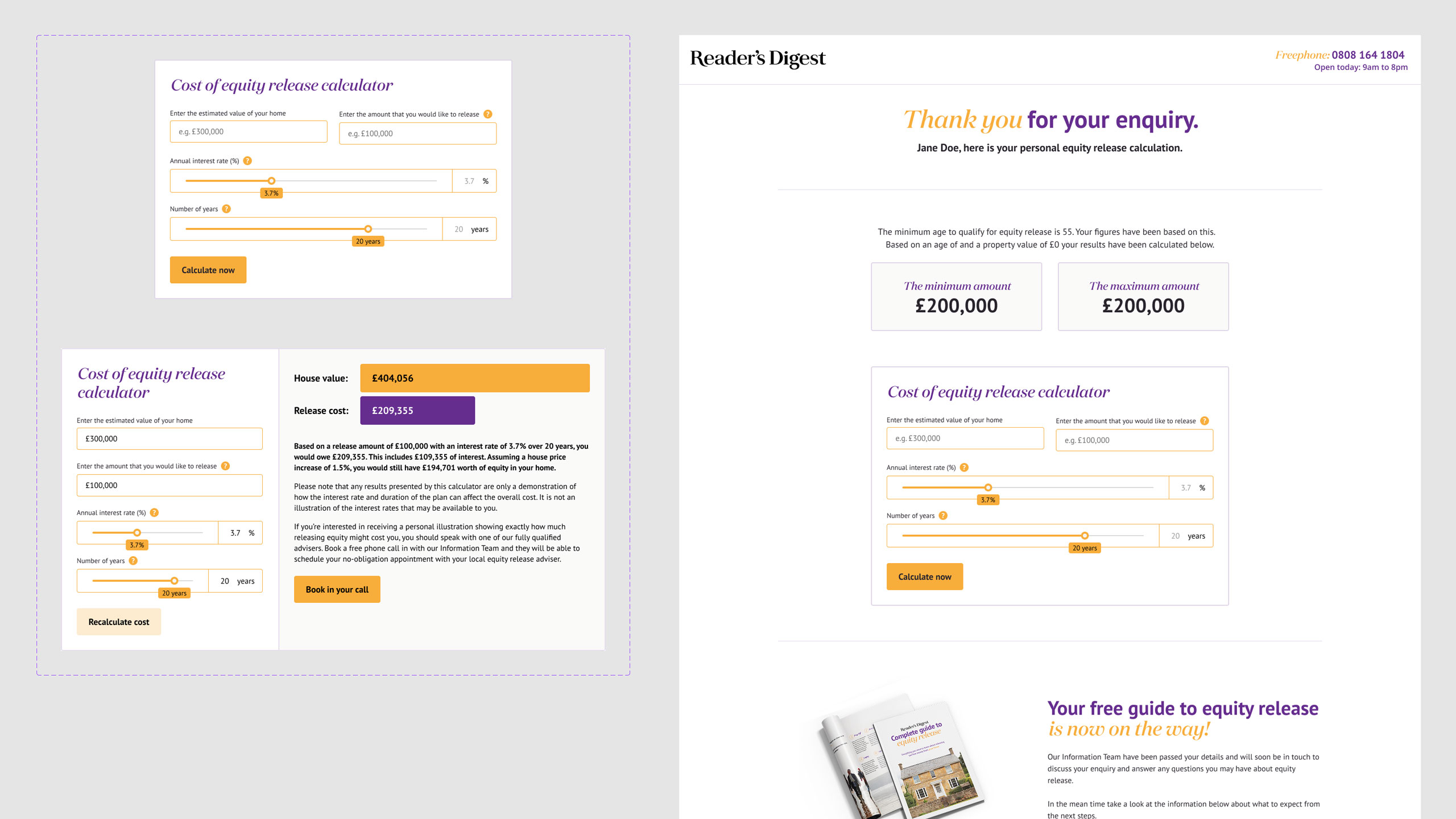
My approach was to break down the complex calculation into digestible steps. Instead of confronting users with a single intimidating form, I designed a flow that guided them through the process, explaining each input and why it mattered. I created multiple wireframe iterations, testing different approaches to presenting the information.
Some versions were too simplified and missed important nuance; others were too detailed and lost users in complexity. Finding that sweet spot required several rounds of feedback and refinement. The visual design focused on making financial data feel approachable rather than intimidating, using clear typography, plenty of white space, and visual indicators to help users understand their progress.
Testing
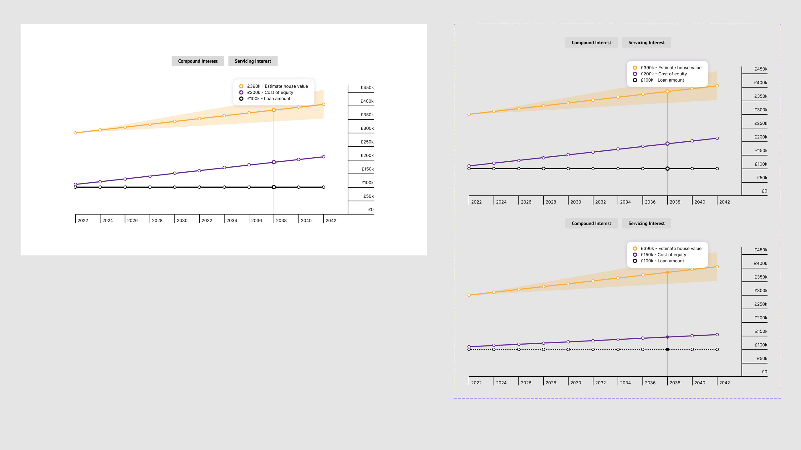
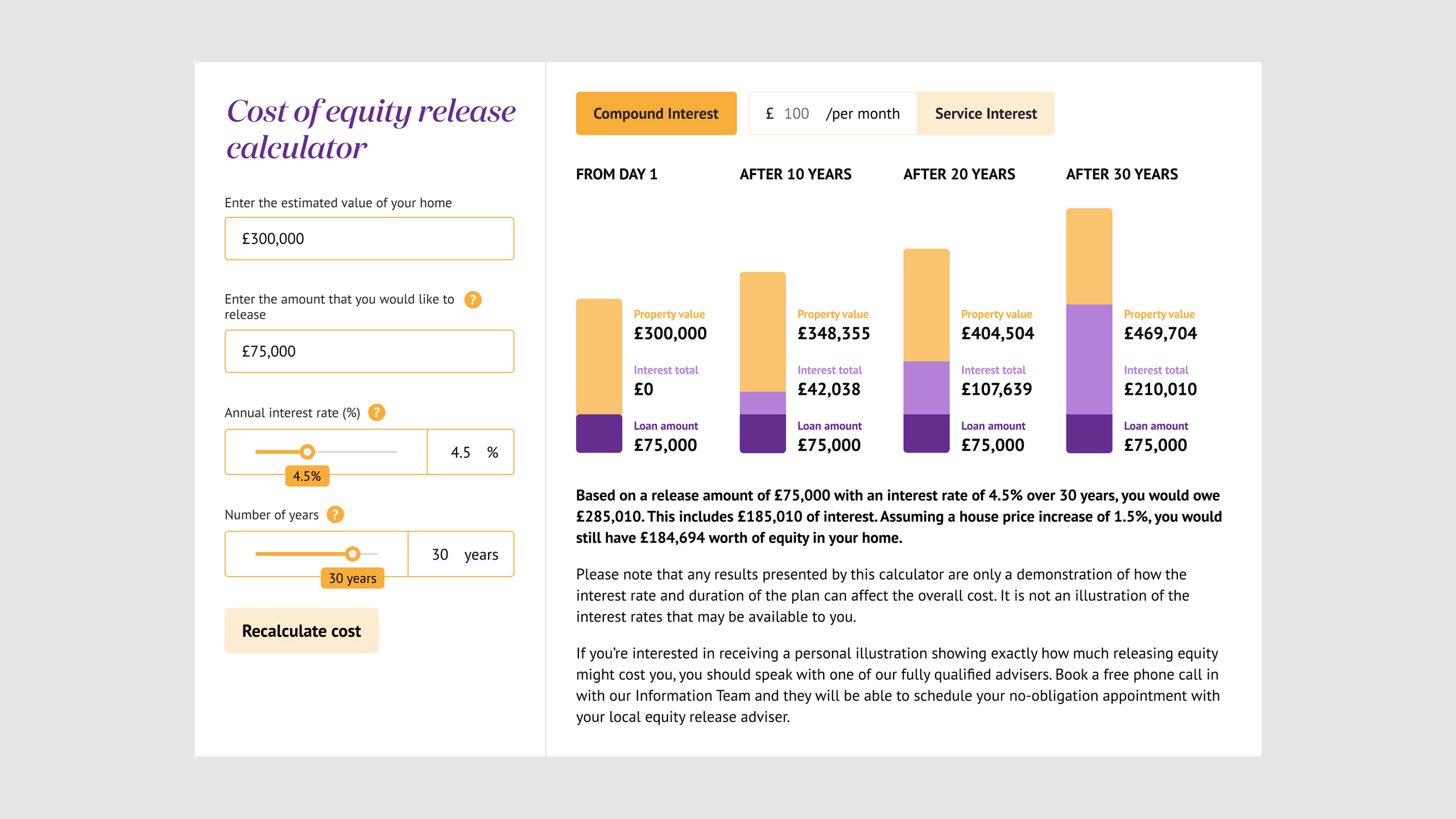
The interface design required careful attention to calculation accuracy and user feedback. I designed the calculator with real-time validation and clear error states to help users input valid data, then worked with the development team to implement these features. The interface provided immediate feedback as users entered information, helping them understand how their inputs affected the final calculation. I had to account for multiple possible outcomes, input variations, and age ranges throughout the design process.
Testing revealed surprising insights about how people approach financial calculations online. Although you would imagine users would want to see the whole picture in detail before making a big financial decision, testing revealed that users actually just wanted an answer with better insight later down the road provided by a human rather than a webpage. This meant we went through multiple iterations of varying complexity. After all, this was for equity release which is typically targeted at people aged 60+, so the design needed to be particularly clear and accessible for this demographic.
Final Solution
The finished calculator successfully transformed that original scrap paper sketch into an intuitive, educational tool. Users could input their information, see real-time feedback, and understand both their results and the reasoning behind them. The tool struck the right balance between simplicity and sophistication, making complex financial concepts accessible without oversimplifying them. Whilst the Reader's Digest calculator is no longer accessible online, Responsible Life merged with Royal London in 2024 and the calculator was repurposed for their website in a form of my original design.
This project taught me a lot about designing for complex, specialised domains. It's not enough to make something look good – you have to understand the subject matter deeply enough to make it accessible to others. The success of this project came from combining technical execution with genuine understanding of the user's financial education needs. The fact that the design was deemed valuable enough to be repurposed by Royal London demonstrates the lasting impact of creating user-centred solutions for complex financial tools.
Other projects

Get in touch, lets chat!
I'm always interested in hearing about new opportunities and projects. Whether you need Webflow development support, want to discuss a website project, or have questions about my work - feel free to get in touch.