Active Cloud Management (ACM): From internal chaos to market ready.
Transforming an internal technician tool into a commercial product through comprehensive UX research and systematic UI redesign.
Services
Project role:
Lead UX/UI Designer
Completion date:
January 2025
Client:
Transforming Learning Group
The origin
I didn't win this project through a pitch. In 2023, I built a personal CRM prototype to help manage my family's property rental business — a practical tool designed around real workflows. Paul Osborne, a business mentor connected to my agency, saw it and recognised something in it: that the way I'd thought through the user experience suggested I could untangle something far more complex.
Paul was CFO at Transforming Learning Group at the time. TLG had developed an internal tool called ACM (Active Cloud Management) and they had a problem. He connected their development team with Upshot, and I was brought in as Lead UX/UI Designer.
What ACM was
ACM was genuinely sophisticated software. It pulled live pupil and staff data from a school's MIS platform, mapped pupils to teachers and year groups, and then provisioned the necessary user accounts and workspaces across Microsoft 365 or Google Workspace — automatically, at scale, across secondary schools throughout the UK.
The technology worked. The interface did not.
Built by an engineer for internal use by technicians who already understood the system, ACM had never been designed for anyone else. TLG's ambition was to commercialise it — to make it a product that any school IT administrator in the country could pick up and use. That ambition had a significant obstacle: the software was so unintuitive that TLG had deployed an entire team just to document it and train people how to use it. Without that hand-holding, users regularly made critical configuration errors — errors that could require a full system reset to resolve, in school IT terms, that meant bricking the infrastructure that managed every pupil and staff account in the building.
The question wasn't "how do we make this look better?" It was "how do we make this safe enough and clear enough that it doesn't need a training programme to operate."
Understanding the problem
I started where the software started, with the engineer who built it. Over several days I walked through the system, asked questions to build a mental model of ACM's functionality, noting questions and building a mental model of what the system was actually doing beneath the surface. In between those sessions I spent time in a staging environment, navigating the software myself, constantly trying to break things and understand why.
Once I knew the system well enough to have opinions about it, I arranged interviews with three other people: a developer on the TLG team, a school IT administrator who used the software regularly, and a training advisor — the person whose entire job was explaining ACM to new users. Each interview was structured around failure: where confidence collapsed, and which parts of the software required the most explanation. They were, in effect, a living map of the interface's problems.
Two distinct problems emerged from this research.
Problem one: no safeguards. The software had no guardrails between a user and a catastrophic mistake. Critical configuration steps had to be completed in a specific, undisclosed order — undisclosed because there was nowhere in the interface that communicated it. Users who didn't already know the correct sequence could, without any warning, trigger errors that required a complete system reconfiguration to resolve.
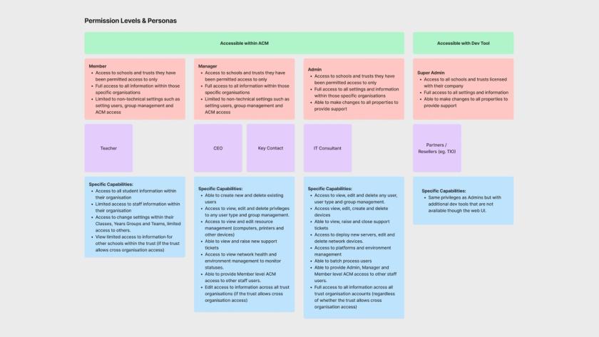
Problem two: no identity for non-technical users. A significant part of ACM's intended value was giving school stakeholders — headteachers, department heads — visibility and transparency over their IT infrastructure. But those users were presented with the same interface as the technicians doing the configuration work. For a headteacher, ACM was not just unusable: it was completely unrecognisable as something relevant to them.
These were two different classes of problem, and they needed two different classes of solution.
The approach
I started with wireframes, not visuals. Opening Figma to make things look polished before the underlying flows were resolved would have been the wrong instinct — and it would have produced a more attractive version of the same broken experience.
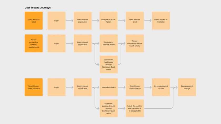
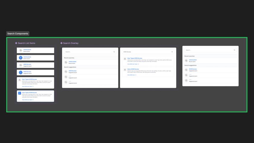
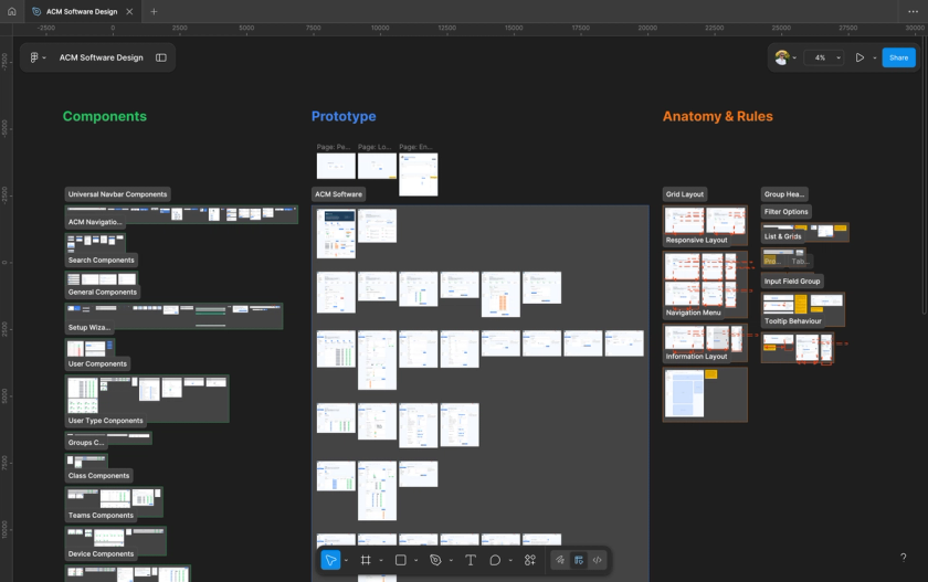
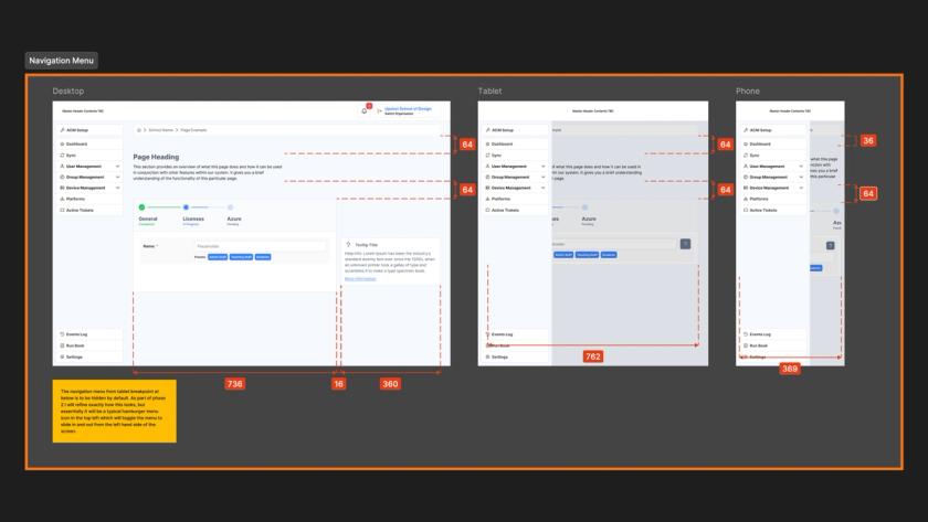
Working from use cases and expected user paths, I mapped out how each user type needed to move through the system. I tested wireframe concepts with technicians asked to complete simple tasks, which quickly surfaced assumptions I'd made that didn't survive contact with real users. Each iteration testing produced refinements. Only once the flows and UX decisions were resolved did I begin applying TLG's specified PrimeVue UI kit as the visual layer.
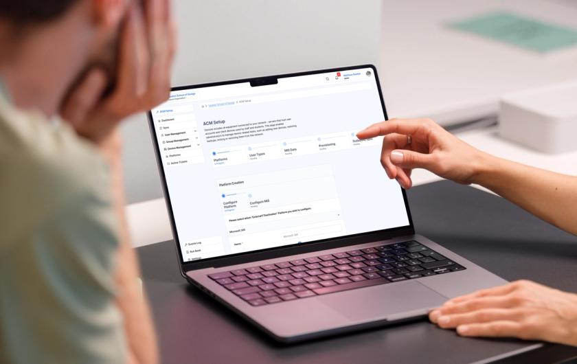
The single most significant design decision of the project was the setup wizard.
The original ACM had no guided onboarding. Users were dropped into the system and expected to know, somehow, the correct sequence of configuration steps. Getting it wrong didn't produce a helpful error message: it produced a broken system. The setup wizard enforced the correct sequence and blocked access to anything else, eliminating the possibility of critical early configuration errors entirely. Once setup was complete, a persistent visual status layer gave users, including non-technical stakeholders, a clear, readable picture of what was working, what wasn't, and whether anything needed attention.
For the headteacher who'd previously found ACM unrecognisable, that status layer was the entire product.
The outcome
The project ran from November 2024 to January 2025. By the end, ACM had moved from an internal training dependency to a product with a guided onboarding experience, role-appropriate interfaces for technicians and stakeholders, and a visual system built to scale as new features were added to the roadmap.
Formal metrics weren't captured within the project timeline, but qualitative feedback from ACM users, training advisors, and TLG stakeholders was unanimously positive — a meaningful contrast to a starting point where the system had been, by their own admission, too difficult to use without significant external support.
If I were to do this project again with more time and budget, I'd have pushed harder for usability testing with a broader set of school IT administrators earlier in the process, and I'd have involved headteacher-level stakeholders in the research phase rather than designing for them based on secondhand insight. Those are the gaps I'd close first.
Interested in reading more
Every project starts with understanding what users actually need, not what they think they want. These examples show how that focus translates into websites that deliver real results.
Christian Youth Enterprises
Repositioning a well-loved activity centre for its 40th birthday — translating a new brand identity into a digital presence built around two clear user journeys.
Devonia Water
Streamlining the water delivery ordering process with an interactive system that eliminated phone calls, reduced manual errors, and gave customers confidence in every order they placed.